Concepting &
Print Direction
SEASONAL COLLECTION STRATEGY
PRINT & PATTER DESIGN
MOOD BOARD DIRECTION
VENDOR EXECUTION
COMPANY
Destira
ROLE
Print Director
— THE WORK
TENURE
2019 - 2026
SCALE
8 collections/ year
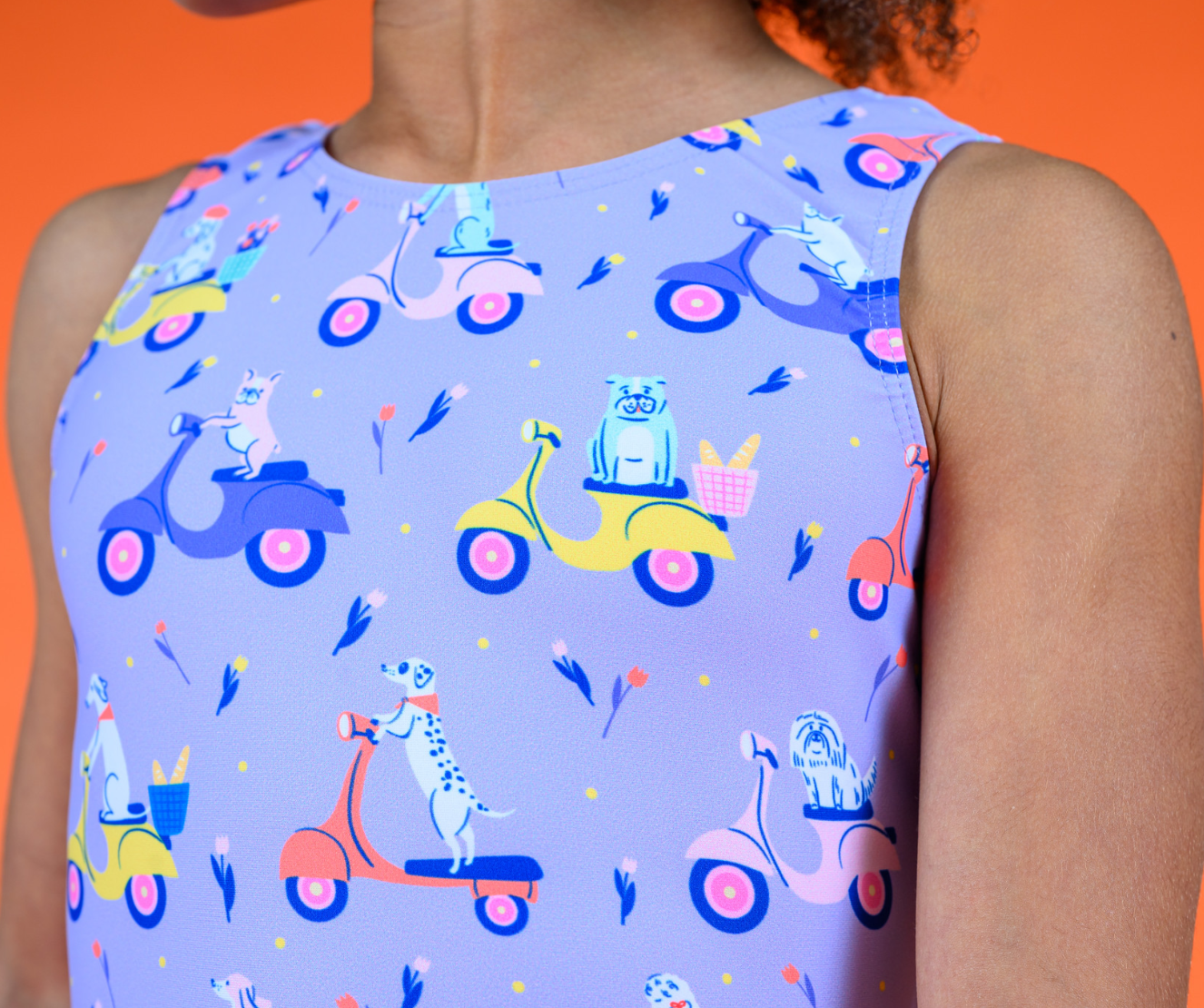
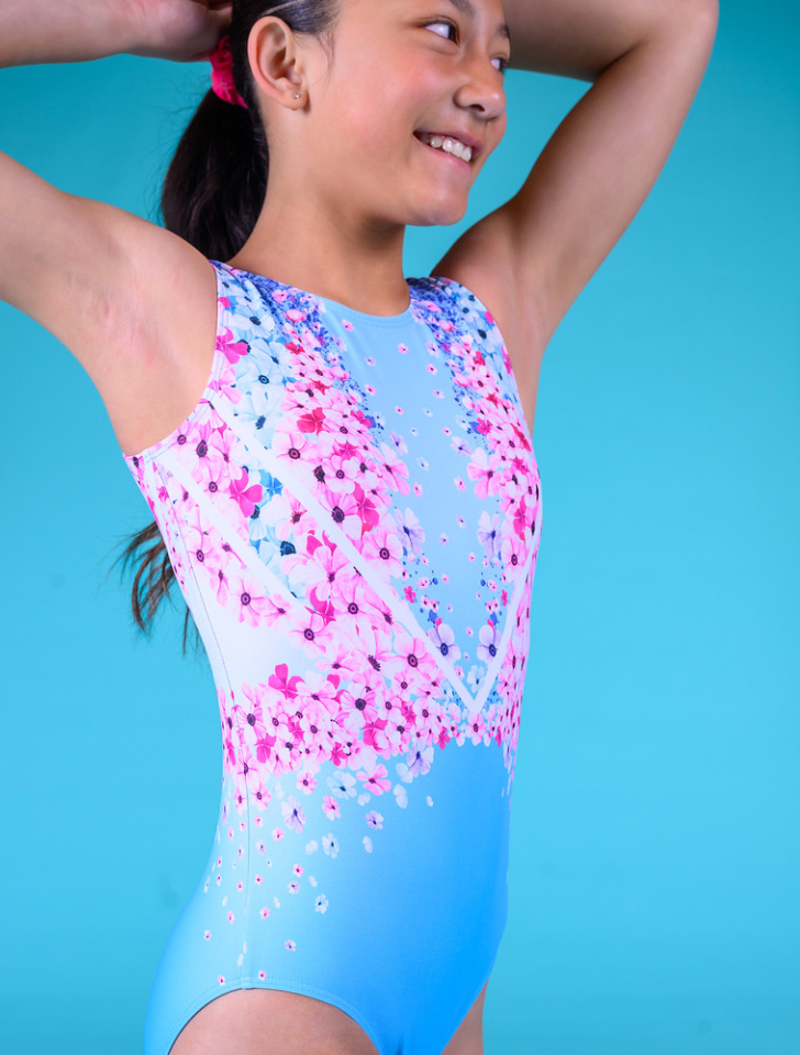
From Story to Product
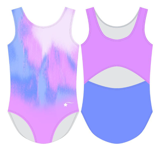
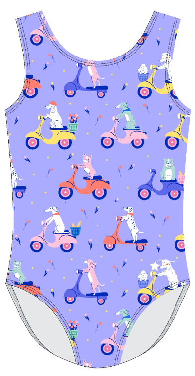
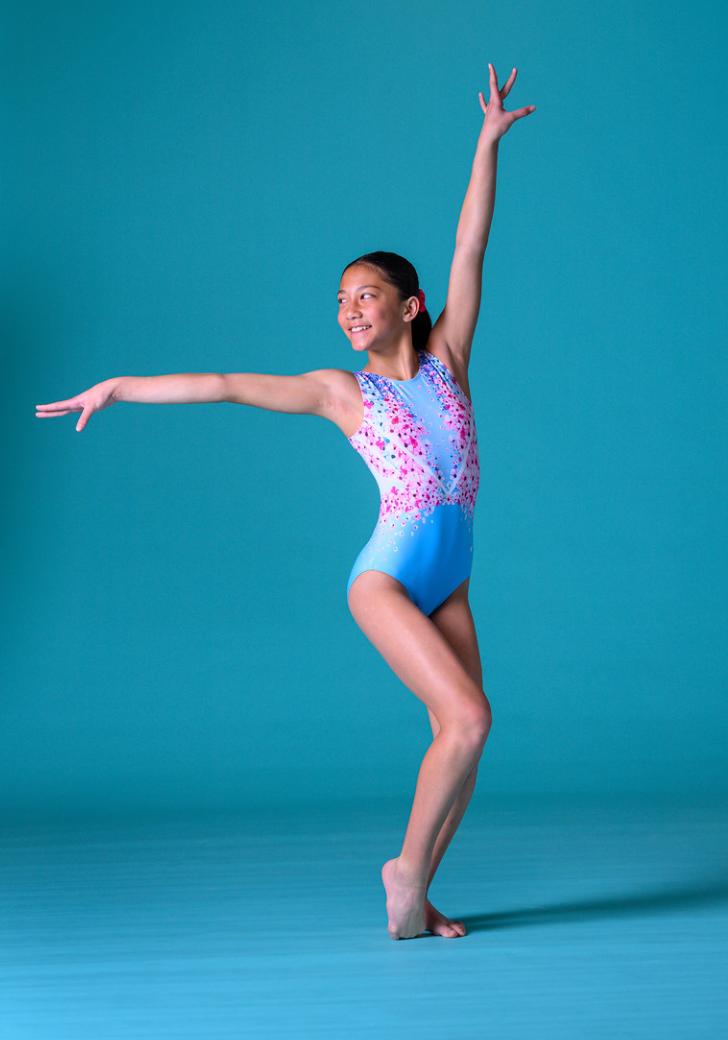
Destira makes gymnastics, swim, and activewear for girls. The brand competes on design — distinctive seasonal collections that gymnasts actually want to wear in the gym.
As a print director, the job was to build those collections from scratch, four times a year. That meant defining a seasonal concept, creating the mood reference, developing original prints, and directing the vendor through to production-ready leotard patterns.
Each collection had to be visually cohesive, brand-consistent, and designed to stand out on a competition floor. Every print was original — no licensed artwork.
01
Concept
Define the seasonal story — cultural reference, color feeling, visual world
02
Mood Board
Create visual reference: editorial, photography, art, material texture
03
Print Design
Original illustration — repeat tiles, motif families, surface pattern
04
Colorways
Palette development — primary, secondary, and accent across the collection
05
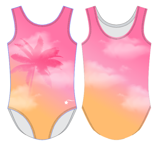
Spec & Vendor
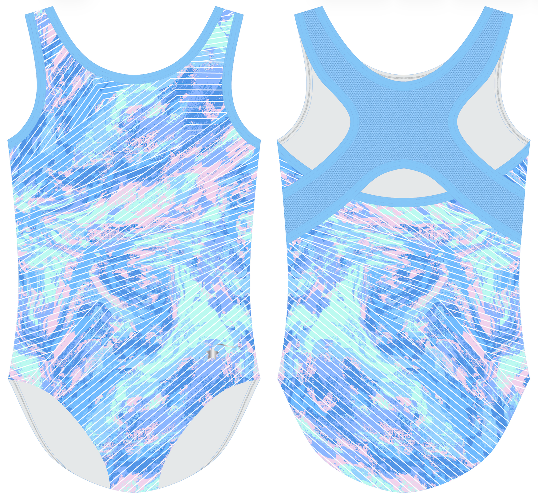
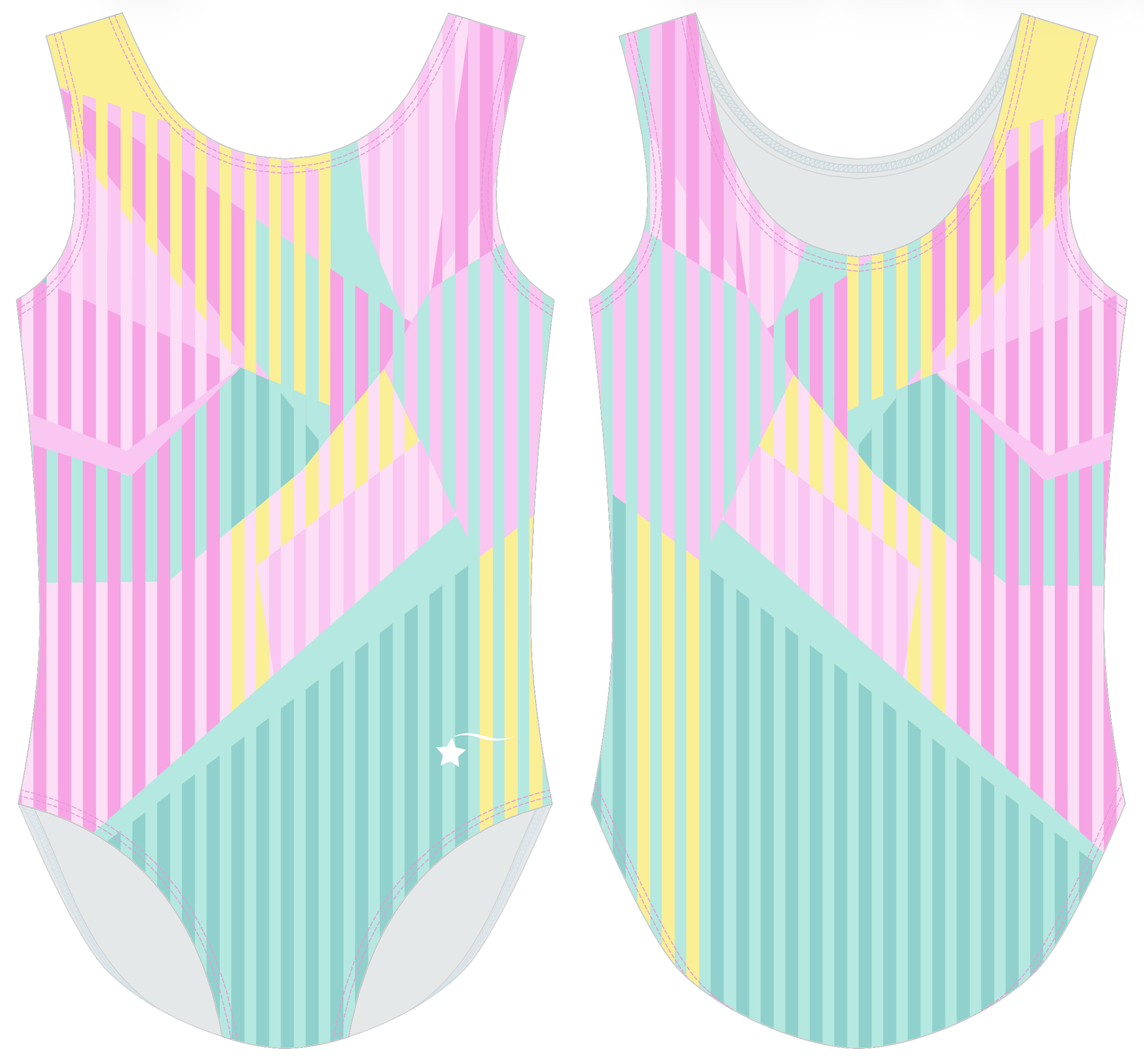
Technical flats, print placement guides, production-ready file delivery
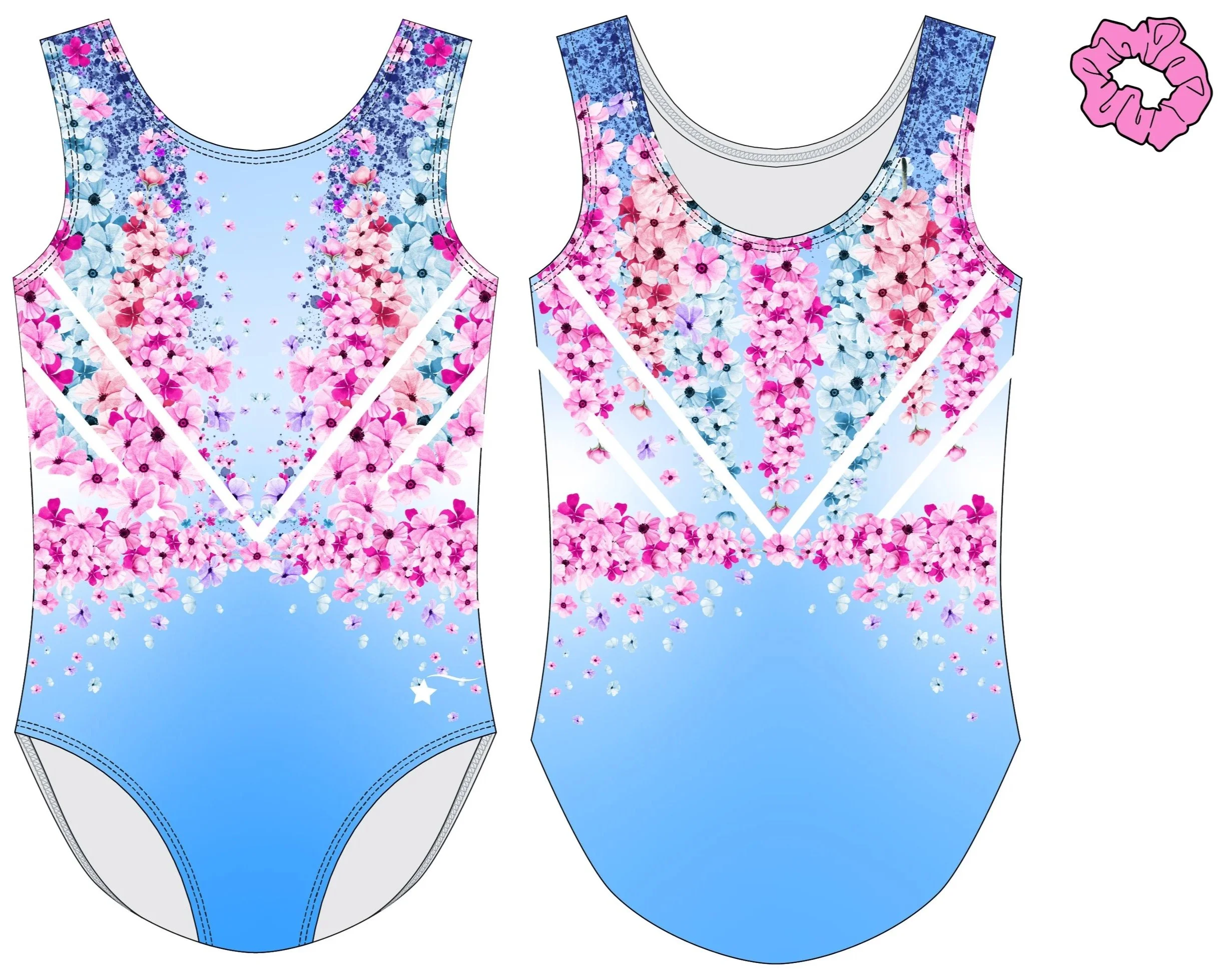
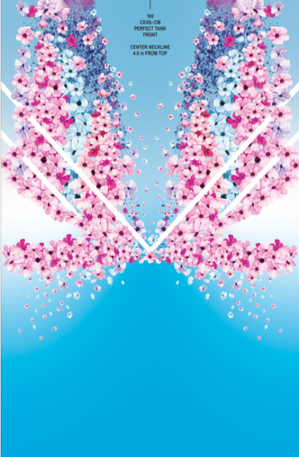
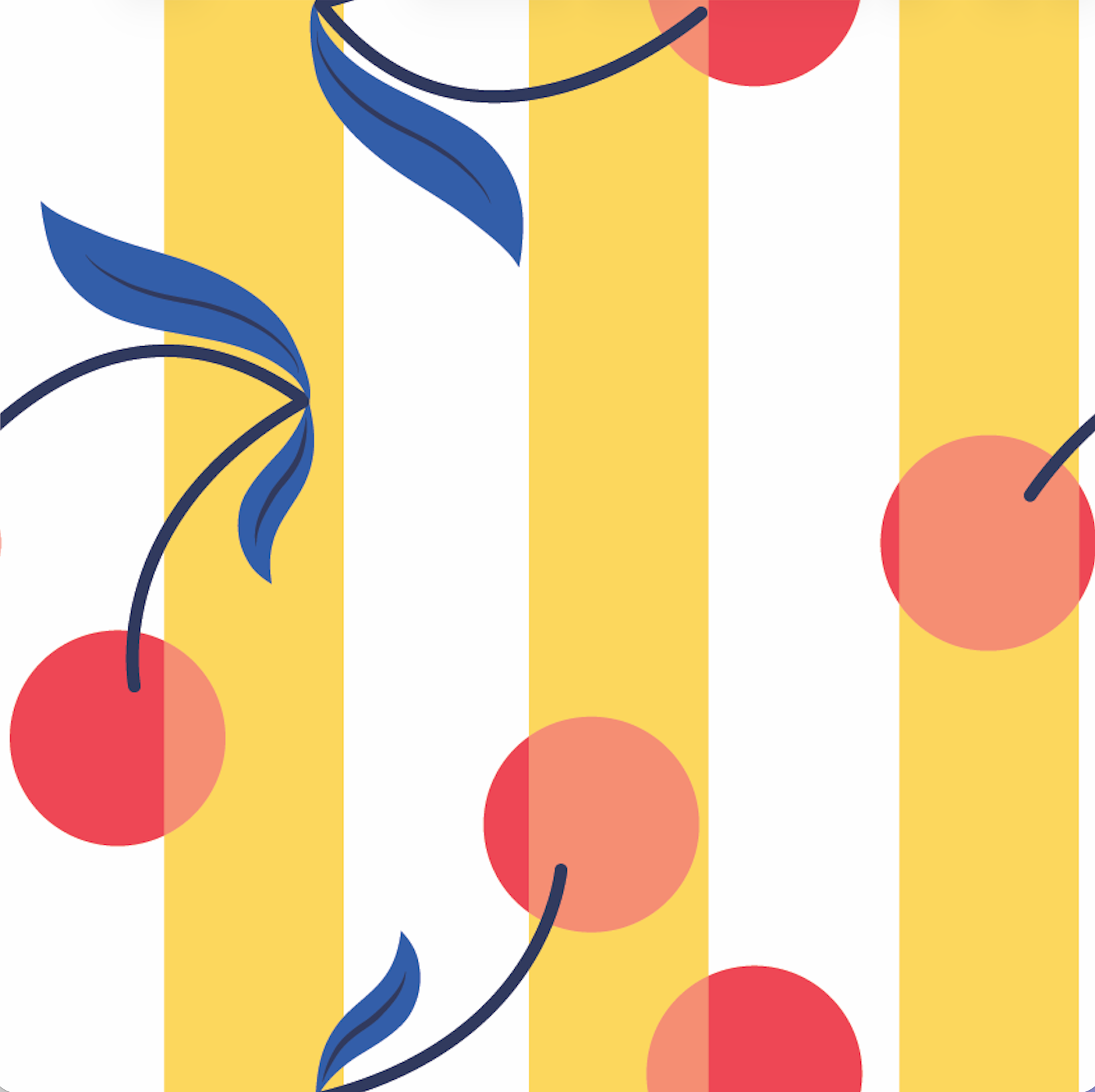
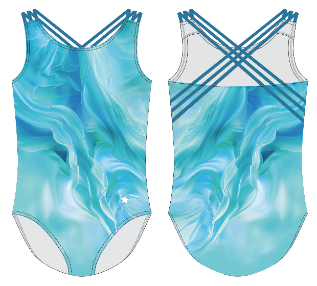
COLLECTION 01
Amalfi
Mediterranean summer - cobalt, terracotta, lemon cream, warm white
Inspired by the Amlfi coast — ceramic tile patterns, sun-bleached linen, the geometry of Mediterranean architecture. The palette built from saturated cobalt and terracotta, grounded by warm white and cream. The printed needed to feel hand-crafted without looking rustic — a fine line between artisan and polished.

ORIGINAL PRINTS — CUSTOMER BRIEF: FIVE TO ELEVEN YEAR OLD GIRL


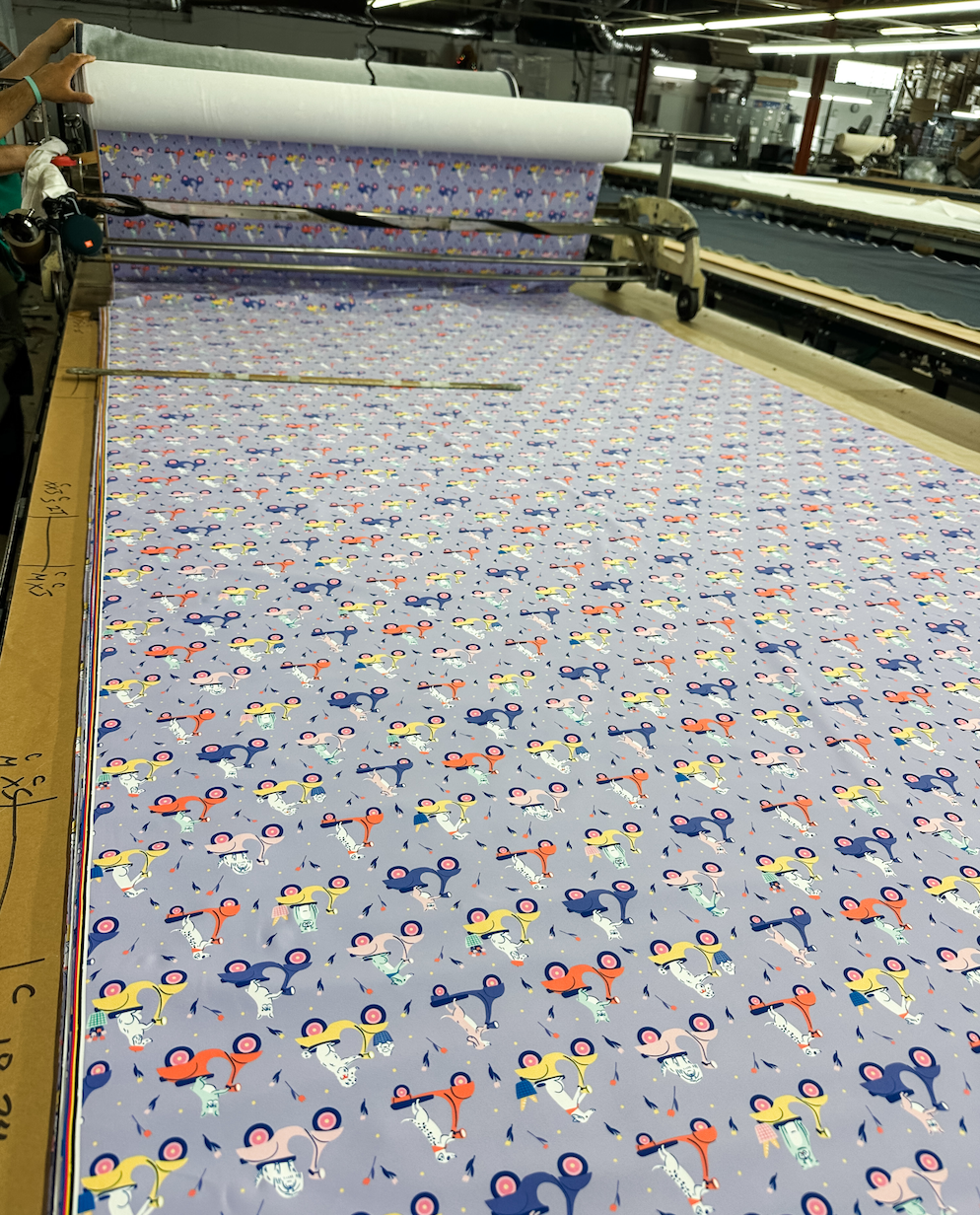
PRINT PROCESS: RUNNING YARD GOOD/ PRINT REPEAT
PRINT PROCESS: ENGINEERED PANEL PRINT
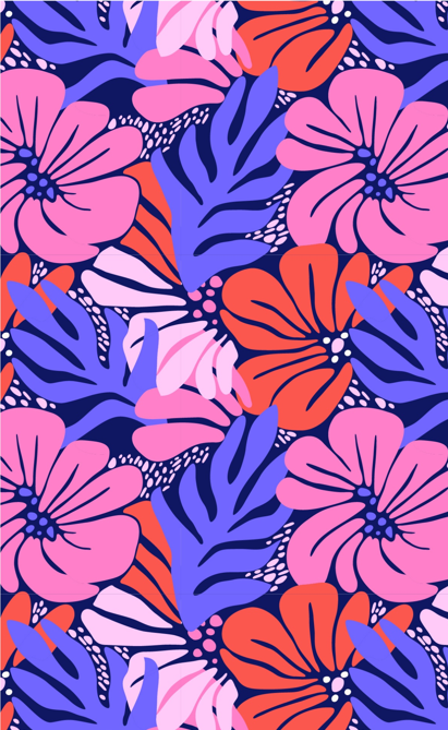
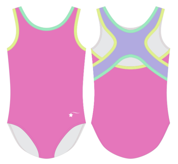
COLLECTION 02
Neon Dream
90s maximalism - electric pink, acid yellow, electric blue, black
A deliberate swing toward cultural nostalgia — the hyper-saturated palette and pattern energy of early 90s sportswear and street style. This collection required the wildest print vocabulary: abstract blobs, graphic type-as-texture, electric neon grounds layered with geometric fills.
The challenge was keeping it legible as a gymnastics product — bold enough to read across a competition floor, cohesive enough to feel like a designed collection rather than a mood board explosion.

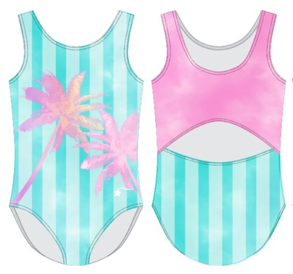
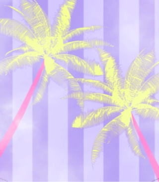
COLLECTION 03
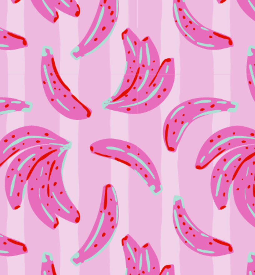
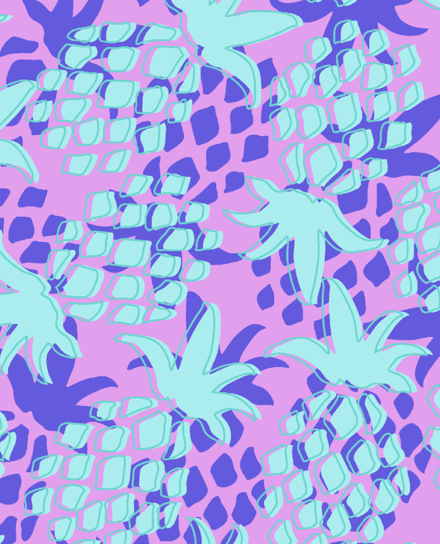
Tropics
Jungle maximalism- sun washed turquoise, hibiscus pink, mango, lilac, and soft aqua
Rich botanical density — a study in color, scale and play. Pushing the illustration vocabulary toward something lush and maximalist while keeping the product wearable on the gym floor.
This collection leaned hardest on the hand drawn quality of the illustration work. The complexity of the motifs required careful scaling decisions — what reads as a full garment print, what becomes a placement graphic, what works as a border treatment.

A collection is a decision about what matters. Every print, every color — intentional.